
“When Gregor Samsa awoke one morning from troubled dreams, he found himself changed into a monstrous Perth Convention Centre in his bed.” Franz Kafka- Metamorphosis.
That’s my preferred translation anyway. OK, here it is, the all time most requested TWOP topic, but one that although I have had it photograhed for some time have resisted posting. You know that most of the time TWOP tries to be reasonably light hearted and amusing, but it is just too difficult to be anything but scathing about the place.
The outrageous quote from (I think) the Architects Society President, which boiled down, claimed that the architects were forced to build an ugly structure due to the constraint of the brief from the government really had me seething. Is it any wonder that Perth is what it is with that awful attitude. It is from the constraints, whether cost, location or whatever that innovation and brilliance should come, not a whimper and surrender. Perhaps it is because of the endless backlash over the CC that the Government has overreacted with the the foreshore design, and gone too far the other way, making sure they can’t be accused of blandness this time. It does look like some of The Convention Centre might be masked by the new development. A small mercy.
 ::
::  ::
::  ::
::  ::
::  ::
::  ::
::  ::
::  ::
::  ::
::  ::
:: 

IT BURNS.
LikeLike
Thats a particularly flattering shot LA. I’ve never been there, does it function as well as it looks?
LikeLike
If it didn’t cost $30 an hour to park there, people might be willing to overlook the overwhelming “silver-backed cockroachyness” of the place.
At least then we could call it the “Foreshore carpark with attached convention centre” and not wince.
LikeLike
I’ve always been flabbergasted most by how the loading bays were positioned to face the river! mornons!
LikeLike
But it’s good for union stop work meetings ;)
LikeLike
um.. although i hate to say it, i dont mind it. i tend to side with the architects on this one, and that report from the society(?) probably has a lot of truths in it. from what i have heard/and from people i have spoken to,who worked at cox at the time, and others cloesly associated with the planning/design/proposal etc it does seem the city imposed some heavy guidelines. and not particularly the original guidelines, but what tends to happen in perth(all the time) is the original scheme is presesnted, and the council demands its changes, and usually they are wrong, and the end result is a half baked simulacra of the original desing. i know the original included brilliant landscaping and an intended raising of the entire strucutre to flush with st georges tce, to create a much smoother area/transition etc. but the govt scrapped it all. just like most big buildings the council waters them down. like this foreshore the council will only build a sever diluted version of it. which will of course have problems, because they are not architects. it seems everyone is willing to tell architects they are wrong, when they are unqualified, and think they can do better. what if we told doctors’ no i dont thin kyou know what your doing, ill do the surgery you moron. it wouldnt happen. why does everyone assume they can do it to architects? end of rant.
ps i dont like cox.
LikeLike
I’d love to know how long the plans were in the public domain before it went up…. I dont recall any front page pics or much pitchforking in the streets either, we just passively rolled over and went back to sleep I think!! Disgraceful!
LikeLike
Thanks Tom, appreciate your thoughts. People also like to make stupid suggestions to the work of graphic designers, but both sets of professionals have to put up with it and try and shine in spite of the dumbarses. The architects have failed to outshine the meddlers and dumbkoffs here, and I still think that it’s generally but not completely their fault that they were unable to do so. It would be like a Graphic designer agreeing to use comic sans font. It’s not the same thing as surgery, it is more like cosmetic surgery, where the client might request a ridiculous nose job. It would be up to the surgeon to explain why it would not work, as it is he or she that will be judged by the result.
Mazarina, yes, it is this type of thing that flabbergast even non architects.
Anonymous Perthon, the inside works well as a modern Convention Centre.
James N. The carpark is full every day I go past it.
LikeLike
Mazarina, re: “But it’s good for union stop work meetings”.
That used to be the role of The Entertainment Centre.
LikeLike
The comment you are referring to LA is this one :
“15 November 2007
The West Australian
I write in response to the statement (IC, 12/11) that the convention centre is an “architectural abomination” and a readers reference to the building as “that other monstrosity” (IC, 13/11).
From an architectural perspective, the convention centre is in fact a well-resolved solution for what is basically a large shed and it has met the design brief extremely well.
Had this building been constructed anywhere other than on the foreshore there would not have been a derogatory murmur as to its architectural merit. The issue here is not the architectural solution but the political and planning decisions made at the time and that is where people should direct the criticism.
Rod Mollett, ( President , WA Chapter RAIA ).”
LikeLike
you make-a-the good point la. the medical analogy was a bit extreme. but you get the point. maybe its also a case of being at the end of your tether. i can imagine every proposal you put in ,the council rejecting/messing with it etc, youd get a little tired of it. then again ,the fact it has no windows on the river side is beyond me. Also! people whinge about eh ycant we be like melbs, etc, their convention centre is the king of windowless sheds! a convention centre calls for a shed, and we got one. bully for us.
LikeLike
Well, clearly we are going to have to have a Worst of Perth Convention there then.
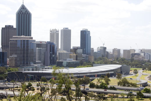
When viewed from the lookout in Kings Park, it doesn’t look so bad, you can see the architects intent and that its sited well
LikeLike
I have to admit that from the inital viewing of the photograph, it looked like it curved around. But having looked a little closer, I see it’s just a long shape with a falt roof. At least Adelaide’s Convention Centre (also on the river) has a big-arse wall of windows to look out…
LikeLike
I think perhaps the north-point on the plans was in the wrong direction, resulting in it being built with the loading dock facing the river view. And then, everyone involved had to pretend they meant it to be that way, because… uhh…
LikeLike
“Had this building been constructed anywhere other than on the foreshore there would not have been a derogatory murmur as to its architectural merit.”
Brilliant! If only we ignored all context – the building’s location at one of the main focal points of the city, in the foreground of the most popular viewing location, on the banks of the river – we would realise what a truly wondrous shed it is.
You can’t argue with logic like that, people.
LikeLike
Tomthrett you are right – the Melbourne Convention Centre is one truly awful building and the Perth Convention Centre (having only seen it in this picture) compares pretty favorably. However, positioning the building with it’s back to the river is quite unforgivable and looks like architectural ineptitude rather than council interference. I mean, what half-baked architect could not fight and win the “I think we should put windows facing the view” argument!
LikeLike
Yeah, truly it is awful. But I’m sympathetic to the architects because it was clear from the start they were being hamstrung. There are at least a *few* points of interest in the northern and eastern aspects. I also had heard they were going to build in front of the convention centre, thus no windows. Perhaps that was a hold-over of another scuttled foreshore plan, groan.
At least there has been a changing of the guard at the Perth City Council. I don’t think this would have been built if the council were not being (mid)guided at the time by that Skeletor in a suit, Peter Natrass. With She-Ra-Scaffidi in Castle Greyskull, I think things are looking up in the city!
LikeLike
She-Ra Martin? Heh heh. Funny. Apparently she’s a TWOP reader, so she might just take up that title. Yes, the east is the only area of interest really.
Bento. You’re exactly right. He might as well say, “Well if I wasn’t the President of The Royal Australian Institute of Architects, my statement wouldn’t have sounded so fucking stupid.”
Adam 75. Some nice pics on your site.
LikeLike
golden1, i am glad you agree melbourne is just as bad. but as for ‘what half baked architect’ even though i dislike them, it would be hard for many people to win a convincing argument with them, seeing as they are the most important, influential and prominent architectural company in wa, they probably know a little bit about what they are doing.
LikeLike
If they are the most important, influential and prominent architects in town, they have even less excuse for being rolled by Council Dunderklumpens and meddling idiots.
LikeLike
Big shed + no windows = world wide design solution for convention centres. I can’t think of any anywhere that are not butt ugly. Perth is in good company in this regard. But it does deserve extra scorn for the way it cuts off that part of the CBD from the foreshore. Most convention centers I can think of only interupt the sea of parking lots that surround them.
LikeLike
Ummmm tomthrett I kind of meant that THEY should have won the argument against the meddling council for precisely the reasons you have put forward – most important, influential, prominent architectural company etc
LikeLike
Who wants to go to conventions anyway! they’re all the bloody same – acres of crap. The only thing I have ever bought (at a Womens Expo that I was dragged to under sufferance) was some jewellery cleaning powder and I am sure you would find the same little stall doing the same demonstration on how to keep your rings clean at the motor show and the Sexpo.
Actually I imagine the demo would differ slightly but still…
LikeLike
@23 -cimbali
I still use soft tissue-on-a-roll for that purpose :)
LikeLike
Not a moistened towelette man Rolly?
LikeLike
I think if it had windows on the river side, it would be quite stunning. I went to a wedding reception there recently, and the view from the inside out is amazing.
From South Perth, the shape of the roof gives Perth an interesting curve, but honestly, the roof and the information graphics inside and out are the only thing aesthetically pleasing about it.
LikeLike
To really assess the CC, go back a step and see what was originally mooted for the area. Apply the same transformation to the current plan for the foreshore and it is all the good stuff that will be ditched again.
What you’re promised taints the view of what you finally get.
LikeLike
I wish someone had gone to that bulk art show on there recently for me.
LikeLike
didn’t need to go to the bulk art show – saw it on TV
LikeLike
I wanted someone to get a shot of a painting of a snow leopard for TWOP.
LikeLike
I think it’s quite nice… it’s got a low profile and is tucked out of the way next to the freeway so it can usually be ignored.
I think it’s stupid there are no windows facing the river though…
LikeLike
it looked like this
/\ /\
/ \—/ \
= =
= 0 0 =
= + =
= ^ =
—
woof
LikeLike
How about in binary AH? was it 00010100110010000011001010000101000101110101010001000
or,
00101001100100000110010100001010001011101010100011?
LikeLike
I actually think we should keep it there forever as a reminder of to everyone of what should not be done in the city ever again.
If anything it’s served us well in creating debate about how Perth and buildings within the city should be developed.
LikeLike
PCEC haiku:
Function over form
Insects under falling leaves
Ignore the river
LikeLike
no comment
LikeLike
The council are happy. The most expensive parking in town is always full, but the architects can’t be pleased. A popular move to have the place demolished is not good for the show reel.
LikeLike
Design I quite like and at varying views as you drive long the freeway looks quite impressive.
Just think it was badly placed. Anywhere else its architecture might have been more appreciated. Maybe sometime in future when funding allows they could cut out huge dramatic ovalesque window right cross its rear so one can see the river. Would’nt be so bad then.
Maybe even great.
LikeLike
Plus I agree with LA’s thoughts on the architects. PISS WEAK.
LikeLike
Elementary my dear flotsam just place another cockroach on top of the previous, and another and another and another [just like in the kitchen] preferably with windows and we’ll have a really interesting skyscraper flotsam old boy!
LikeLike
Should be bulldozed. What’s so architecturally difficult about creating a big space? St. Peters in Rome, or any medieval cathedral, is a big, but beautiful space. Beautiful inside, beautiful outside.
I think it was the same architectural firm responsible for the new justice/courts building in Freo. I was stuck in that building for 9 very long days last year (on a jury) – another horrible, dysfunctional building. Should also be bulldozed.
There was that rather attractive suggestion that the roof of the convention centre be painted with an aboriginal dot-painting motif. I think it should. Perfect complement for the new swan island.
LikeLike
While they are all just soulless sheds on the inside, not all convention centres are big ugly sheds on the outside, have a look at what can be done –
http://www.vbfun.com/conventionCenter/conventionCenter/default.asp
Virginia Beach convention centre – lots of windows. And they sometimes have interesting shows – I went to the Knife and Gun Swapmeet at this one. Most frightening thing I have ever seen – lots of large americans in camouflage gear circumventing the already lax gun laws.
Maybe Dullsville isn’t so bad a place to live.
LikeLike
Pingback: Romancing The Wombat « The Worst of Perth
Pingback: Bingo was its name. « The Worst of Perth
Maybe if the lazy builders supported the roof properly so it was’nt sagging it might look O.k. No, seriously this is one dire effort.
LikeLike
the thing is just awful, the only good thing about it is the crazy on/ off ramps that came out of it… fly around those at speed… good times…
LikeLike
Pingback: Weekend Worstoff 20 « The Worst of Perth
Is it true it overlooks the river, yet there are no windows to see out to the river?
LikeLike
Yes. And from the river it looks like a wool scouring factory.
LikeLike
Ever Since the Big Ferris Wheel went the view of perth looks daft.
LikeLike
I’ve tried to like THE THING, but I just can’t!.
Like so many others have said, it needs glass fronting the river.
The building THEN would show some appeal and potential as one we might learn to kind-of-love.
On a side note too…I know that from a logistics point of view it works for them, but I wish Channel Seven would get Telethon OUT of the Convention Centre and return it to the intimacy of the TV Studio. It leads to already shouty presenters shouting at their huge live audience and produces a hollow cavernous sound for the musical acts..It’s the ugliness of the outside of the building, turned inward.
LikeLike
Do you know Fiona of Mt Lawley?
LikeLike
Pingback: Shedism, Perth architectural style | The Worst of Perth