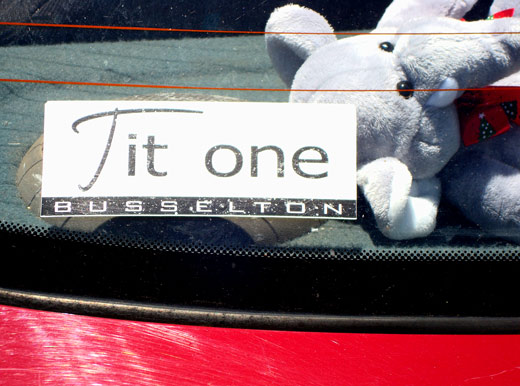
It is well known that red inks fade fastest in the sun. Remembering that would have saved some embarrassment when printing these stickers. In real life it was just possible to just see the red lines that made this read Fitzone rather than Tit one, but I didn’t have time for careful exposure. Actually Tit One sounds like a worthy establishment too. The sort of place you’d have a special gold keyring for. Or perhaps it’s an admonishment. “She wouldn’t show me tit one.”
 ::
::  ::
::  ::
::  ::
::  ::
::  ::
::  ::
::  ::
::  ::
::  ::
:: 

Actually it has more of a knitting pattern feel to it. Tit one, pearl one…
LikeLike
Are you sure that’s not Troy Buswell’s car ? :-) That sticker suits him perfectly, consider his recent revelations of his “Party Tricks” in the Speaker’s Lounge :-)
LikeLike
Good point Frank. I should have thought of that before. The “elephant’s trunk” would have suited him too.
LikeLike