
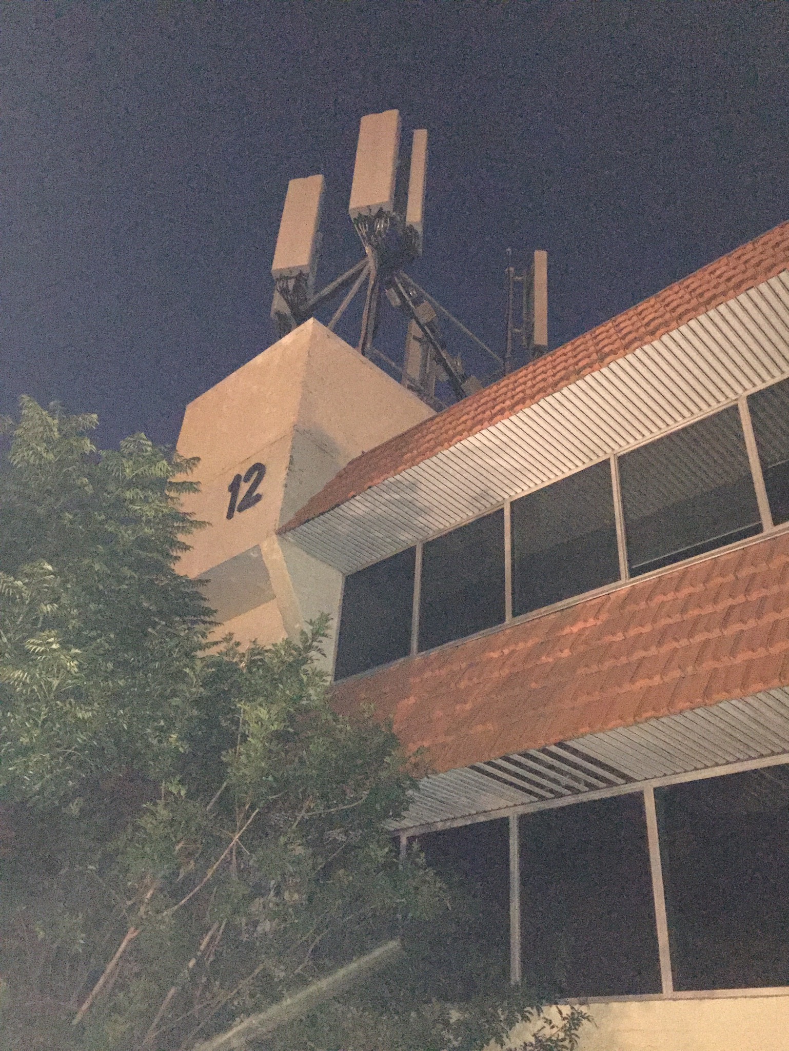
I wanted to get this lovely Kalamunda piece of ugliness earlier, but it would be harder to show that the building is essentially derelict right in the town center. No doubt not helped by proximity to tired ole John Day’s tired ole electorate office. Kalamunda business, the powerhouse of the hills, where lights blaze late into the early afternoon. In other news, Kalamunda Cartridge World had closed. True and sad story.

Okay, I’ll bite. This is the Silicon Valley end of Canning Road, right?
LikeLike
Well it’s not the Statin Quarter if Leederville.
LikeLike
Eavesdropping or dropping eaves……take your pick
LikeLiked by 1 person
Why not have both in this case ?
LikeLike
Vodafone and Optus are the only tenants taking space in Kalamunda these days.
LikeLike
Replace it with 12 storey mixed use residential development NOW
LikeLike
That sturdy sans serif “12” is a big fat Fuck Off to handwritten style or brush script in a hexagonal box Po-Mo Shit fonts that are de jour with the crowd who peddle Teh Vibrancy. That merits its existence for mine.
Also, those 1970s design cues just cannot be made Vibrant; a dreary but effective bulwark that is resistant to hipsterism (as is Kalamunda in general). Besides, I’m certain that the flaking whitewash doesn’t conceal the type of brickwork that these charlatans covet… again, makes me kind of appreciate it in a vindictive manner.
LikeLike
I don’t mind this building. That it has that phone tower on it, is tenantless and near derelict in the centre of town is the issue.
LikeLike
Good point: I did solely focus on the building itself. Those other aspects are indeed qualifiers for Worst Worthy. They could rip it down and replace it with some Po-Monstrosity, but it’d still be saddled with a mobile tower, be tenantless and quite rapidly reach dereliction. It’d just uglify it more, become a worst (though not a Worst) utterly bereft of charm.
LikeLike
And it will soon be opposite an Aldi!
LikeLike
This building is quite lovely , would be difficult to replace , and should be protected .
I am serious about this and was only being ironic about putting up a podium block on this site
LikeLike
As Bernard Tschumi once wrote of the unrestored villa savoie in Architecture and Transgression :
‘ The most architectural thing about this building is the state [of decay] in which it is . ‘
Oui ou non ?
LikeLike
Perth Regional Style
LikeLike
Helvetica Bold would be part of it
LikeLike
I thought as much too: the “1” certainly looks like that font, but not so sure about the “2”, if only for the angle confusing the perspective. At least it’s not Arial Bold.
Still, could be even worse than Arial, the signifier of amateur signwriters everywhere: at least it’s not some hideous current hipster-approved marker-style typeface that plagues most new developments. Nothing like an extra bold-type Univers, Helvetica, Microgramma or yes, even Gill Sans Ultra Bold, to tell Po-Mo Shit to verily Get Fucked.
LikeLike
Helvetica bold was the go-to ‘Letraset’ font of all brit-trained architects of the 1970s . Yank ones at pretentious schools too .
(The Vignellis were in ascendant as graphic designers in those days .)
One had to rub it off waxy sheets and on to ones Canson vellum 6-H pencilled axonometrics in the aspirational paleo-Eisennann style .
( NB where it comes to sanserif and architecture i am a Futura man myself )
LikeLike
The Futura Will Never Be Seen In Kalamunda, unless of course it’s of the elderly Ford Falcon kind. I too am partial to Futura too… very closely related to the typeface that the PWD used in WA on their buildings from the 50s and 60s, definite Not Worst too. And I doubt you’ll find that in Kalamunda and even if you did, going Back To The Futura wouldn’t save it!
LikeLike
Yes, futura is very nice
LikeLike
Hahahaha! Letraset! Still a going concern, apparently:
http://www.letraset.com/
LikeLike
Even typewriters are back, so…
LikeLike