I love that the office of drugs and alcohol has a pixellated sign. Understand that this is not a video screen, this is the actual sign. Making sure you are sweating when you enter. You just can’t trust these graphic designers.
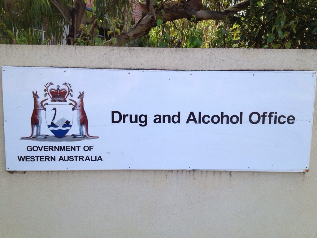
I love that the office of drugs and alcohol has a pixellated sign. Understand that this is not a video screen, this is the actual sign. Making sure you are sweating when you enter. You just can’t trust these graphic designers.
| Anonymous on Alexander The Great’s… | |
| Anonymous on Sandringham | |
| Anonymous on V Capri | |
| Anonymous on The Beachist | |
| Anonymous on Alexander The Great’s… | |
| Anonymous on A House is not a home… | |
| AHC McDonald on Cockington Dog | |
| Anonymous on Cockington Dog | |
| Anonymous on The Bunbury of The North | |
| Anonymous on Old Mill Rising | |
| AHC McDonald on Old Mill Rising | |
| Anonymous on Old Mill Rising | |
| AHC McDonald on Rooting on The Wrackline | |
| Anonymous on Rooting on The Wrackline | |
| AHC McDonald on Old Mill Rising |

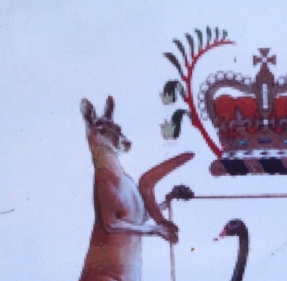
Forget pixellated: you go in the drug place and tell them you’ve just seen two kangaroos holding boomerangs and a shield, and they’re threatening a swan and and the swan is floating on blue – yes, blue, instead of shitty tannin and pollution brown – water, and there’s a crown and it has kangaroo paws growing out its sides, and the kangaroos are averting their eyes from it, and the whole ensemble is casting a shadow that bears no relationship…
and see what happens.
LikeLike
DFOC-style ‘screenshot’ sent to the sign writer?
LikeLike
Yes, yak it up, you carpet-grabber.
You’re going to love the real special sun-streaked, grime-encrusted shot I have lined up for Outrage Sunday.
LikeLike
Must have knocked up the sign in MS Paint
LikeLike
its kickin in
LikeLike
Hire a “Graphic Artist”?
Not if you want a decent job done.
LikeLike
More on the car v. house
http://www.abc.net.au/news/2014-02-13/car-crashes-into-garage-in-perth/5257408?section=wa
Talk about bad driving – he missed the loungeroom by miles!
LikeLike
Obviously somehow had moved from the garage to the loungeroom just moments before.
LikeLike
With the decline of Jim’s Vajazzing, it’s now Jim’s Pixels. Still, doubtful business model.
LikeLike