Debbie S. Says that the totally effective sock treatment is being given to the unfortunate Beafort Street sculpture. Expect 5 more years of fence hire.

Debbie S. Says that the totally effective sock treatment is being given to the unfortunate Beafort Street sculpture. Expect 5 more years of fence hire.
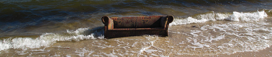
| Anonymous on The Beachist | |
| Anonymous on Alexander The Great’s… | |
| Anonymous on A House is not a home… | |
| AHC McDonald on Cockington Dog | |
| Anonymous on Cockington Dog | |
| Anonymous on The Bunbury of The North | |
| Anonymous on Old Mill Rising | |
| AHC McDonald on Old Mill Rising | |
| Anonymous on Old Mill Rising | |
| AHC McDonald on Rooting on The Wrackline | |
| Anonymous on Rooting on The Wrackline | |
| AHC McDonald on Old Mill Rising | |
| Blood on Old Mill Rising | |
| Anonymous on Alexander The Great’s… | |
| Anonymous on Alexander The Great’s… |

Is there any explanation as to how the art is rising? Is it made of dough?
LikeLike
It’s absolutely risible.
LikeLike
What yo talkin bout Willis ?
https://www.facebook.com/savetheguildfordhotel
The socks , as a “this stinks” protest on the Guildford hotel , may ( with emphasis on the may) have achieved the protesters’ aim.
LikeLike
Start your own hang ya undies campaign on the fence. The skidmarks will match the burnouts
LikeLike
In Mt Lawley? It’ll be festooned with CK tighty whiteys and Happy Socks.
LikeLike
Socks? They’d have to import them fro COP.
LikeLike
And you know, it might just work covered in socks.
LikeLike
Bremick tendered on the work for $100k but now requesting more funds…..
You will enjoy this from the artist;
“The interlinking typography, held together when supported by the stage but slowly falling into collapse and disarray when not, is a metaphor in itself for the many varied ways in which a strong community supports each of its members…..
Abstract colour and form within the platform’s tessellated surface will create the appearance of a Persian rug, the nature of which will provide a sense of familiarity……
Steering away from primary colours and those often used by multinational fast food companies, the initial colour of the oversized lettering will be a contemporary champagne hue chosen for its bold but inoffensive hue reminiscent of the colours found in many of our native flora, modern graffiti art, traffic lights etc.
Of course, the green of the rug, inspired by nature’s carpet, grass and low native groundcovers, will also therefore be compatible with the lettering and when set within the concrete and steel edge detail, this balance of industrial and nature-inspired colours will sit beautifully.”
LikeLike
Registered lawn verge collection, then. Perfect.
LikeLike
I thought it was a metaphor for the eagerness of city councils to waste money on crappy art projects which cause passers-by (and bloggers) to jeer and scoff.
LikeLike
are the traffic lights on Beaufort Street a ‘contemporary champagne hue?’
maybe at the Mount Lawley end.
LikeLike
the traffic lights on Beaufort Stre, you mean?
LikeLike
Isn’t this “news” a year old?
Also, from the comments:
“I’d rather have a local sculpture than Michelangelo’s statue of David. Which better reflects our community?”
LikeLike
Davo wouldn’t be caught dead in Mount Lawley.
LikeLike
Yes, but applying the “are we better off for it being there” test, I really don’t know. Whereas the rabbit boozies/wille thing while not to my taste does seem to be an improvement on the corner, vajazzled as it already is with the gay knick knack shop. But this? Can it be possible that it has worsened this section of the street? Would a Cocos hedge have been a better choice?
LikeLike
it’s fucking hideous.
we are worse off.
LikeLike
The execrable execution has removed any possible benefit that could have resulted from what was at best a mediocre idea to start with.
LikeLike
And wedding groups. Is that The Arrondissement’s type of crowd? (Note, there was some talk that it would attract wedding parties to have their pictures taken in front of. Although photographers would have to stand in the middle of the road. And it would look crap.)
LikeLike
I’d like to know if the council’s beef is that the T didn’t get the vomit colour or that the the rest did?
LikeLike
Cocos Hedge. Whoa!
LikeLike
Persian rug? I’m not getting that vibe. At all.
LikeLike
Persian rugmuncher?
LikeLike
Maaaate Fringe Festival is over. Deal with it.
LikeLike
Will it come back?
LikeLike
Philistine. The earliest Persian rugs were made of foot thick concrete.
Painted in a champagne hue.
Or something.
LikeLike
That would take some munching.
LikeLike
But just try telling that to the new age softies at the Basso front bar.
LikeLike
With reobar?
LikeLike
I just assumed these colours were chosen for their relative inability to show up vomit, piss and rust stains as well as the inevitable graffiti sand-blasting scuff marks.
LikeLike
“The interlinking typography, held together when supported by the stage but slowly falling into collapse and disarray when abandoned by the side of the road, is a metaphor in itself for the many varied ways in which a strong community supports each of its members, or not.
Abstract colour and form within the platform’s tessellated surface will create the appearance of a Persian rug, the nature of which will provide a sense of familiarity to those of us whose Persian rugs are made out of cement and leaned up against the wall.
Steering away from primary colours and those often used by multinational fast food companies and the human body, the initial colour of the oversized lettering, before graffitit artists add their own vibrant palette, will be a contemporary champagne hue chosen for its bold but inoffensive hue reminiscent of the colours found in oh, hell, I don’t know, champagne, I guess.
Of course, the green of the rug, inspired by nature’s carpet n’ drapes, grass and low native groundcovers, will also therefore be compatible with the lettering and when set within the concrete and steel edge detail, this balance of industrial and nature-inspired colours will vagina.”
LikeLike
It always comes back to vaginas.
LikeLike
The culture of post-capitalist hegemony is strictly congruent with the construction of the image. The construction of praxis is virtually coextensive with the reification of the image. The systemization of normative value(s) recapitulates the reification of the gendered body. The eroticization of the gaze is virtually coextensive with the engendering of the gendered body.
LikeLike
ok, firstly let me tell you haw many things are wrong with this statement….you’re obviously ignorent and don’t have all the facts about this project. Secondly that whole speal wasn’t said by the artist…where did you even find that????
Thirdly…there is no apostrophe in ‘platforms’
and finally, and I could be generalising here a bit….but you are a twat!
LikeLike
You spelt spiel wrong
LikeLike
and how, and ignorant.
LikeLike
There were some worker types fussing around this morning. Maybe adding the portaloos.
LikeLike
City of Vincent workers trying to stand up the ET.
LikeLike
There is a possessive apostrophe in “platform’s tessellated surface”. Didn’t you learn anything in Kindergarten ?
LikeLike
sadly the protest sign was gone today.
socks tomorrow?
LikeLike
What’s that font? OuTRAge outre?
LikeLike
Too sans to be mine.
LikeLike
I like Debbie S but wow she sure seems to hate us!
LikeLike
Who?
LikeLike