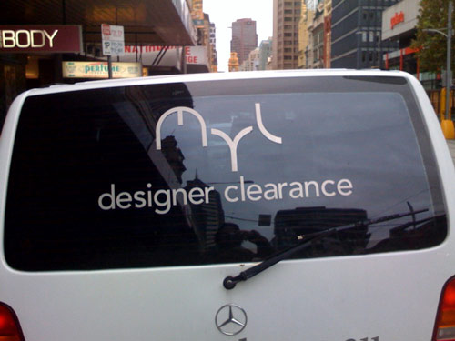
I’m still not entirely back to planet Perth after China, so let me also clear these two amazing worsts from Melbourne. One assumedly designed by a professional, the other beyond amateur. Meccano sent this of MYL Designers Clearance. Now was there no-one at MYL that had the courage to say, “Our new logo looks like a penis, buttocks, and maybe an elbow?” Not only has the emperor no clothes, but he’s waving his cock around your back door! And your elbow! This is supposed to be from a designer? Kuriosz Media has MYL (Or Cock Arse and Elbow) as a client. Maybe the logo was foisted on them. The person who designed this is the same type as the sculptor who didn’t see that this looks like a lion sucking off another lion.
And from amateur land Hokusan (the man whose google searches keep The Worst of Perth at the number one ranking for “Perth’s Worst Anal”) sent in a baffling rendition of Cunt. Who knows what chemical confusion is the explanation behind this. Did it start to rain and he had to complete the letters from inside the shed? No that doesn’t work. In a mirror? And it’s otherwise so neat. Not a moment of hesitation on the strokes.? I’d like to see his take on MYL. I would guess it would be an improvement. Thanks Meccano, thanks Hokusan.


Elbow TLA? I think perhaps, in the same way Shakespeare worked his name into the King James bible, this graphic designer has included his wry smirk.
LikeLike
But you’re with me on the pee pee and botty right?
LikeLike
Why else the wry smirk?
LikeLike
It’s a subtle observation on the Ben Cousins finger gesture brou-ha-ha.
LikeLike
Maybe a bit of boozie curve?
LikeLike
remember when graffiti was witty.
One of my favourites- ” Gravity is a myth – the earth sucks”
Even in the most horrible of fonts, that would still be clever.
LikeLike
the second one is a vag
LikeLike
I can see a case could be made. front bottom, back, whatever.
LikeLike
Well spotted, Clairee. It could be ‘Purple Helmet, Vag, Erection’. Elbow is pleasingly incongruous, however.
LikeLike
I also like side-boob for the third one. Who doesn’t love a bit of side-boob
LikeLike
side boob it is
LikeLike
Looks like the same design firm that did the Economic Regulation Authority logo. Cheap.
LikeLike
Real female boobs dont sit like that so if it has to be that it has to be Our Nikkis.
LikeLike
Is all I can say.
And I’d post that as a link if I knew how to do it.
Dunno how 2 do that upside-down stuff either.
LikeLike
Huh! Automatic link there.
Very neat.
Now how does it work, embedded style?
LikeLike
Please don’t do upside down. As useful as trying to tow an upside down Baravan.
LikeLike
.uɐɔ ʎɐɹds ɐ ǝʌɐɥ ı puɐ ‘ǝʌı1 noʎ ǝɹǝɥʍ ʍouʞ ı
LikeLike
dɯɐʇs ɐ1ɐoʞ uɐǝɹoʞ ɐ puɐ 01/01
LikeLike
ǝʇıuoʇ uo lǝuuɐɥɔ s,ǝuıu ɐɔɐ ǝsınol ɹǝqɯoɯ sǝʇɐƃıʇsǝʌuı ʎɥʍ ɐl ǝlʎʇs ɹǝsɐɥɔ ʎʇılıqısuodsǝɹɹı sı ƃuıuɹnʇ sǝʌooʎ oʇuı pɐɯ sɹǝƃƃɐʇ
LikeLike