
Worst Graphic Design
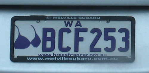
While we’re on an automobile theme this week, what’s with the new number plates? Mr XY was not happy with the design of the Breast Cancer numberplate. I have to agree. The new plates are fairly ordinary. I don’t know about the bra as a logo either. What do TWOP fans think? I’m dreading Year of the Prostate, that’s all I can say.
Here’s another bad one. I used to live in Gooseberry Hill, and I never saw one of these creatures alive or dead. And “Darling of The Scarp”? Hmm. No.


Yes cars cleaned up the bush junk .
LikeLike
Is that a quokka?
LikeLike
Actually it is a Quenda and there are quite a few of the in GH these days. we have them in our back garden but most often see them dead on the road in front of the house so if the number plate was used as a deterrent it would be useful although a head on a pike would probably be more effective! It is the emblem of the local school whose fundraising number plate this is. However none of the above saves it from being pretty badly designed by a member of the P&C.
LikeLike
By the way Microsoft and Apple Mac – A pox on both your houses for allowing mere mortals access to software that allows them to venture into the world of graphic design! If only we could return to the days when the worst a P&C member could do was Roneo 50 copies of the school newsletter.
LikeLike
Cimbali are you serious? P&C designed?
Why does graphic design never get any respect? Why do idiots suddenly think they can design logos? Would the P&C suddenly decide to do its own plumbing and install the new toilets on the roof of the headmasters car?
LikeLike
Pingback: State of Excitement « The Worst of Perth