Which is sadder. The paint job, or the hoodie clad type doing it? Remember it’s taken a year to go from concrete grey, to vomity orange yellow, back to grey again and now to this.

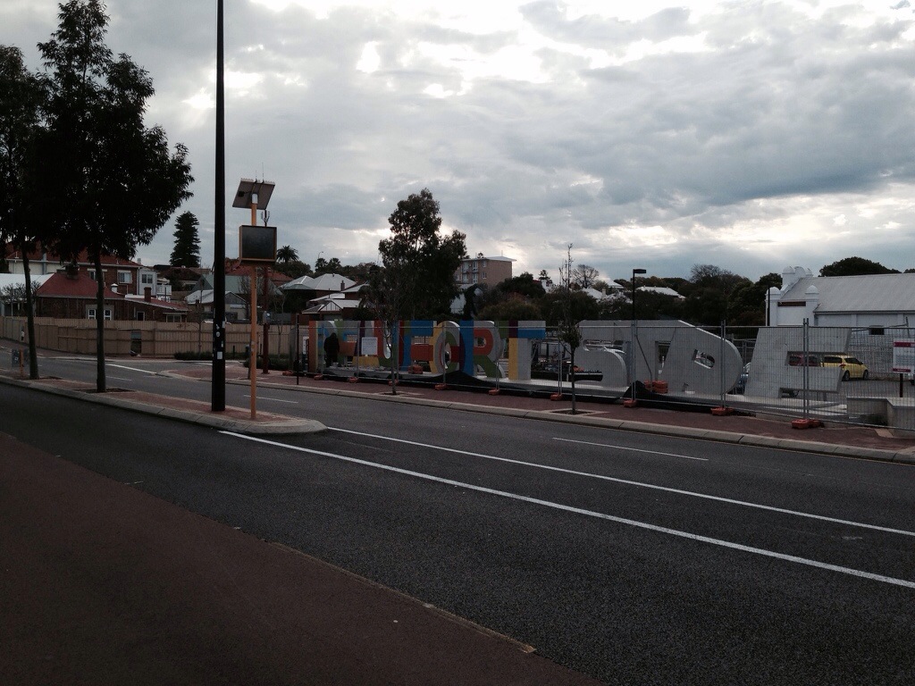
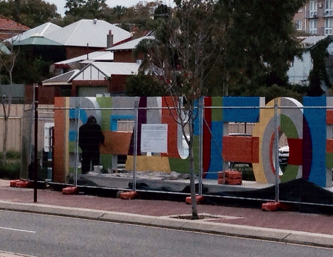

Which is sadder. The paint job, or the hoodie clad type doing it? Remember it’s taken a year to go from concrete grey, to vomity orange yellow, back to grey again and now to this.
| paulie48406 on Pizza Showtime! | |
| AHC McDonald on Pizza Showtime! | |
| Anonymous on Pizza Showtime! | |
| Anonymous on Pizza Showtime! | |
| Anonymous on Pizza Showtime! | |
| AHC McDonald on Pulling Off Trucks | |
| AHC McDonald on Alexander The Great’s… | |
| Anonymous on Alexander The Great’s… | |
| AHC McDonald on Private Dancer | |
| Anonymous on Private Dancer | |
| Anonymous on Private Dancer | |
| Anonymous on Private Dancer | |
| Anonymous on Is Australian Silo Art Ra… | |
| Anonymous on Pulling Off Trucks | |
| Anonymous on Rap Mobile |

Crikey.
LikeLike
Fuck me, here we go. Has a bit of Yarnbombism about it. Absolute worst.
LikeLike
was thinking as i drove past that the colours seemed to have been chosen to tie in with the yarn bombing around the sculpture.
LikeLike
Bill Cosby jumpers will be in fashion again soon. This is the precursor
LikeLike
In a deliberate snub to the original ‘artist’, i note ‘vomity orange yellow’ is the only colour of the Pantone palette not now featured.
LikeLike
You think this is a ring in rather than the original guy changing his vision? If a new hoodie, why not get the guy that the police erased his work.
LikeLike
Pretty sure the Council and original artist no longer on speaking terms.
I understand they asked Shime to do it, but no one could find a step ladder for him.
LikeLike
So he’s hooded to protect his identity in case of some arts demarcation dispute? Was there anyone calling out Scab when you went by?
LikeLike
And the “R” and the “E” still look like they’ve been the innocent victim of some more of the Troy Buswell driving experience. You’d have thought they would have fixed that prior to painting.
LikeLike
or like someone has ransacked your home
LikeLike
It’s a sign.
LikeLike
Of the times?
LikeLike
United Colours of Legoland
LikeLike
What a pile of cunty shit,especially when you have to sit there on beautfarty street in traffic watching the fucking hipsters ride past on their fixes admiring the ‘cultural piece of Shiite’ they call art.
I would rather write bad villanelles while pretending to ge George Gissing than look at this monstrosity
LikeLiked by 1 person
Because you are such an alpha man, and she’d totally want you to. I hate that shit so bad. Just saying
LikeLike
alpha man has edited his comment to remove vile sexism.
shame really, i prefer when dickheads are true to themselves.
LikeLike
DFOC edited it for him, unrequested. You know you’ve gone too far when DFOC pulls out the redacting iron.
LikeLiked by 1 person
That’s teh truth.
LikeLike
should have realised an idiot like that could not have been so poetic.
thanks dfoc.
LikeLike
Woah. Dial it back a little, man.
LikeLike
Sir, I can appreciate setting up the mise-en-scene for the killer line , but this was sufficient to completely derail the cornflake digestion process . Over application of the misanthropriates.
LikeLike
I might add in this footnote that , in Alannah related matters, the highly respected Elizabeth Farelly , thinks that small bars are a source of vibrancy, and so ,IMHO, could be the solution to Kalamunda’s lack of vibrancy.
http://tinyurl.com/jwhymgv
LikeLike
I love Sheryle Bagwell’s work!
LikeLike
Forget about Muntakundra or wherever, small bars now key to Subi vibrancy, nay survival.
http://www.abc.net.au/news/2014-08-26/councillor-criticises-city-for-liquor-licensing-changes/5696174
LikeLike
Suitably edited after teh outrages.
LikeLike
Next time you’re in traffic on Beaufort Street keep going and don’t stop until you get to the Galleria.
LikeLike
The New New Grub Street? I like George Meredith better anyway.
LikeLike
I adore women who flash bits of speech that catch men in their unguarded corner.
LikeLike
I like it! I actually really do like it (and this is the 1st I’ve seen of it).
Also it was never grey before becoming vomity orange as it was a stain within the concrete, not one applied to it.
LikeLike
By the time this thing’s finished, demolished, or whatever, you and your place-making bureaucrat friends will be fawning over the result of the next spin on the public art chocolate wheel.
LikeLike
I’ve put in a proposal to install the words “Public Art” in big concrete letters on Oxford Street. I keenly await the $100K of ratepayers money this project surely deserves.
LikeLike
You’re not aiming high enough. Build it from discarded MacDonald’s wrappers and old shopping trolleys and charge them $500K.
LikeLike
I’ve proposed one across the Elizabeth Quay waterfront which simply says “Ha ha ha taxpayers, you got fucked by Colin LOL”.
I can’t imagine Colon using LOL but it seems appropriate for the setting.
LikeLike
Just “LOL” I think, 20 metres high and made out of swan shit.
LikeLike
Which colour/s?
LikeLike
I think this one was a big mistake. I’m fine with the naked rabbit thing, even though I don’t really their work much. But it does add something. This subtracts.
LikeLike
You’re just not a big thinger.
LikeLike
so you’ve painted stained concrete to look like concrete?
wonders will never cease.
LikeLike
Matt.
You are admitting you have never been to Beaufort St? Implausible deniability?
LikeLike
no I just mean the new paint job.
LikeLike
I’m also fine with the rabbit; it’s the self-congratulatory concept-art wank that really shits me.
LikeLike
I don’t think it is art, is it? It’s just a really big ugly concrete sign. I even wonder if they got the dimensions wrong and only realised after they’d started the pour. Because for the word stre to look like that? It completely lacks continuity. It actually just looks like they suddenly realised they were going to run out of room and improvised in a hurry. I think that is what annoys me about this the most. If it was meant to look like large letters dropped from the sky, then have that theme running through the whole piece. If it was meant to be neat and straight then make it ALL neat and straight. It has ended up looking like a 12 year olds tentative venturing into block writing and they didn’t plan before they put pen to paper. I actually really like the idea of messed up letters, with a sort of apocalyptic feel. But this is just a massive fail in every way. Yuck……I actually hate it. I do, however, wonder if it will become one of those landmarks that people learn to love. Like the space ship on Leach Hwy (May it rest in peace) or the Middland brick house on Great Eastern. But I think not. Those things were well made and interesting.
LikeLike
at a mere $150,000 piss-take of ratepayers money, I’m sure council will be very proud.
I mean they have been busy taking accounting lessons from the Labor Party I’m sure…..
their latest fuck up……oopsie the $3.4 million surplus they said they had in the budget was meant to be a $3.4 million deficit.
now they have been told to get the books balanced by the end of June 2015, their answer is to not do some of the shitty planned stuff and to “cut some essential services”
nice.
then they have agreed to a pay rise for themselves
nice
LikeLike
looser.
LikeLike
Whatever it is that you’re taking, you really need to do it entirely in private.
Posting arse uppards opinions is simply self denegrating.
LikeLike
Julie Bishop, is that you?
LikeLike
http://www.abc.net.au/news/2014-08-15/beaufort-street-revitalisation-progressing/5671778
LikeLike